Wednesday, October 27, 2010

things have been happening.

I have 8 followers of this blog. eight. I am so happy that you 8 follow my blog and are not ashamed to publicize it. thank you.

I made a website. It is all about my lover Cait. I made it to tell the world (Scott Mecham more specifically) why I love her.
Here is the link to it.

Thursday, September 30, 2010

Wednesday, September 22, 2010

Web Design is the new Scrap-booking

Well, for my Graphic Interface class I was told to make a short tutorial on some HTML stuff. I thought to myself I could make a button on my blog that would link to Facebook. I am a real big fat beginner with this web stuff so I felt that this would be pretty easy to explain and to do.
So I perused the world wide web for some tutorials for myself so that I could teach you all. I learned a few things.

-Moms love to blog. I found a hundred tutorials on how to make a button and put it on a blog, most of these were written by mothers. I even had to call my own mom to get some info on how to do this.
-Blogging is like scrap-booking.
-Now I know how to make a link from scratch.

Look to the right of your screen. I made the facebook.com button which when pressed will pull up a new window and link you to my Facebook profile. Awesome. This is pretty simple to do. You could start baking your cookies now and before they are out of the oven you will have your link up and running!

First off you need to make your design or steal one from the interwebz. I made this one in photoshop real quick like.



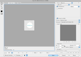
Then you must save for the web. File> Save for Web & Devices…


Your image needs to be saved as a PNG-24. The image size should be 125 px W by 125 px H. When it is saved as a PNG-24 the background is transparent so there will be no box around it. Save your image and name it something that is easy to remember.


Now go online to some image uploading site. I used photobucket.com because that is what my mom told me to do and I do what my mom tells me to do. Anyways, It is a really simple site to use and it's free. You will need to put your image online so that you can link to it.

After its online go to your blog. GO! Go to dashboard>design>page elements. (if you don't have blogspot.com there is most likely something very similar to this on your personal blog.)

Once on the page elements page click on (Add a Gadget). Go to HTML/JavaScript. This will open up a window wherein you may write some HTML.


Real quick lesson here: what is not highlighted is the HTML code for a link. The highlighted text is what the link look likes and what it does when you click it.
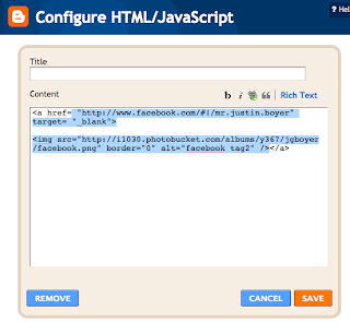


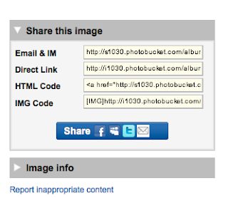
Now you will have to put all your information in it. This is really simple. All you really need to do is some copying and pasting, much like scrap-booking. Go back to photobucket.com, on the bottom left hand side you will find a menu that gives you the codes for your image. Copy the HTML Code.

Now go back to the HTML/Javascript page you were on with your blog. Once you're there Paste the code. You will need to change this a little bit (but not too much-it's super easy). Be sure to delete the URL for photobucket and replace it with the site that you want to link to. Write it inside the quotation marks. I am going to link to facebook.com. So that is what I have in the quotation marks.
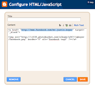
This means it will open a new window.
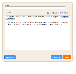
This is the code and link to photobucket.com where you image is.
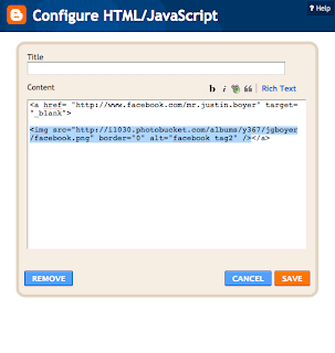
Click save and then check out your blog, you should have a pretty sweet little gadget on the side or wherever you place it. Now go trick out your ghetto blogs and make 'em steezy. Do what your momma tells you.

Thursday, September 2, 2010

what is the point?

Can Design actually make a difference?

I am feeling compelled as of late to do something more- I mean I want to do more. I have to do more than just make posters, packages, or whatever for my whole life. The idea of working in an office or a studio, making something and then talking about it to feel important sounds like a huge waste of a life. How can design be more practical and helpful or useful or uplifting? I am in a painting class-what a huge waste of time. I guess actually paintings are inspiring(or can be). Not my paintings though... haha I am seriously going to have to dig deep to stay in that class.

Anyways, I was walking from that class and I ran into Donny Merrill. He is getting a degree in design and education which is pretty cool. That will, in a small way, change the way people will see the world. Teachers have the awesome responsibility to teach our children how to react with one another. Education is so important.

My brother just finished flight school for the army. He is an Apache pilot- this is also very cool. He will also change the way people will see the world, in a different way, but it will still be educational... haha that is probably not the best way to talk about it but its still rad what he's doing. He is doing an important thing. I really feel strongly about the mission in Afghanistan but that is a whole other topic that I wont get into. I'm proud of him.

So I had the thought that I will be a sad person if all I do is make posters or ads or commercials for money. There must be some way to make a difference with design. How can I do this?

This is really important to me for some reason.

I want to involve myself in the worlds affairs.

I want to do something that will make a difference.

This blog probably sounds so unrealistic or idealistic or something(istic) it might make you sick reading this. I just had an urge to express this.

Wednesday, September 1, 2010

Site Critique


Well, I am in school now and part of school, a large part, is doing assignments. This is one of them. Im excited for this class-if I can get in. It will help me with my grammar for one… which I am terrible at. I will be posting a lot more information on my blog from now on. So be excited all you 5 followers. haha.

This website is so sick. http://www.non-format.com/
Not necessarily the actual website but the content. which is why we all go online anyways (mostly) to find content and to look at it. Not to find a cool website and look at the design. But, this one is both. It has cool content and a really nicely designed site. I feel like It is really smooth to operate. Its a pretty basic layout which is fine- I guess its a little bit like Helvetica.. Everyone uses this type of website design but its ok because it is so easy and nice.

I feel like the design on the website fits their content well. Their work is super stylish and fresh yes, that is a good word to describe it. I like how it feels shiny and clean. haha. The menu is always on the left hand side of the page which is nice because you'll always know where you are and can choose where to go next without going back to the homepage. The site has an excellent sense of visual hierarchy with the images being extra large next to the small menu font and the even smaller submenu.

The color of this site is really basic and refreshing. Its just simple black and white allowing us to view the work without any distractions. I like how when you run your mouse over the different options the gray text turns black. I am also pretty stoked on the fact that there is no music playing in the background. I did not come to this site to be listening to some music but instead to see some good design work. I really hate it when blogs have music running in the background. oh well. It might actually be a good idea for this site to have an option of hearing some of the music that they have made album covers for. I just would like to have the option instead of it just automatically starting. They might be able to make some money if they set something up to sell the music they make designs for… just an idea.

This website is an online graphic design portfolio and I think it does a very good job at showing that without saying it.

Don't go to this site if you are depressed about how bad you are at design, it will only make you feel worse.

http://www.thesixtyone.com/
This is another cool website that plays music... this is ok because I am intentionally going there to listen to it. so visit it. I wont write about it because I am a bad writer and you're bored. The site is a little confusing though. Goodluck!

Monday, July 26, 2010

the End of July

Well I have a tendency to take myself to seriously. I sometimes get so caught up in everything that I think I am so important and BA. Then something usually clicks in my brain, I see some creative thing that is so happy and free and whatever and then "Snap back to reality, Oh there goes gravity." Those are the times that I feel the most creative and expressive and loving and caring and all those things. Its kind of like a miniature bipolar disorder in a way. I like the feelings I get when I am on the back to reality stage. I get stressed when I'm in the outerspace stage or the BA stage. Haha I guess this might be kind of weird but its that stage of humility that I feel the most alive. How do I stay there?
But look at this- how can I NOT take myself SERIOULSY! Yeah BOYEE!I'm sexy like a movie star.
Haha ok anyways.
Cait will be home in a few days. 6 to be exact. It's still so FAR AWAY but so close. I am eagerly awaiting her arrival. 9:30 a.m. Sunday August 1, 2010 Delta Airlines. Terminal 2.

Perhaps I sound pathetic but look at her! How can I NOT be ANXIOUS for her to get back.
She is so HOT! haha
thats all. the end.

Monday, July 5, 2010

July 5th is the new July 4th

I don't know why.
I don't know why not.

If I could type a whole lot of words really fast I would probably update this more. I can't. So I don't. If I could think of funny clever things to say I would probably update this more. I can't. So I don't.

I went on a hike last week in zee middle of zee night. It was beautiful outside in the wilderness. One side of the ridge I was hiking on was all lit up by the full moon and the other side of the ridge was pitch black. I would not appreciate it if God all of a sudden decided to make it dark. It would be really cold and dark. really fast. and it would be uncomfortable.

This is my favorite song. Or one of them. It really has nothing to do with the lyrics. its the sound the words make. and the music. Lyrics are usually dumb or depressing or cheesy or something but when a singer is a little creative then I get stoked. I love how this whole song sounds. unfortunately this music video is only a little bit of the song. But, you get my drift. I think. I hope?

I wish it would play the whole song. oh well.
Also, in other news, today is the 5th of July. Its almost over. The epic 3 day 4th of July weekend is almost over. I went to Provo on Saturday and went swimming with my sisters. We went to Deer Creek Reservoir and swam across it to an island. Well Shelby and I did. the rest did not. We saw a dead fish there in the water. It was just floating there under a tree. Shelby screamed and then we swam back across the lake. This 4th of July weekend was pretty fun. I didn't do much. I didn't try my hardest to be the loudest and the funniest. I didn't worry about anything really. It was pretty mellow and good. I love my life right now. I wish that Cait was here and Travis. I miss my brother. Other than that my life is good.

Now GO look up that song!